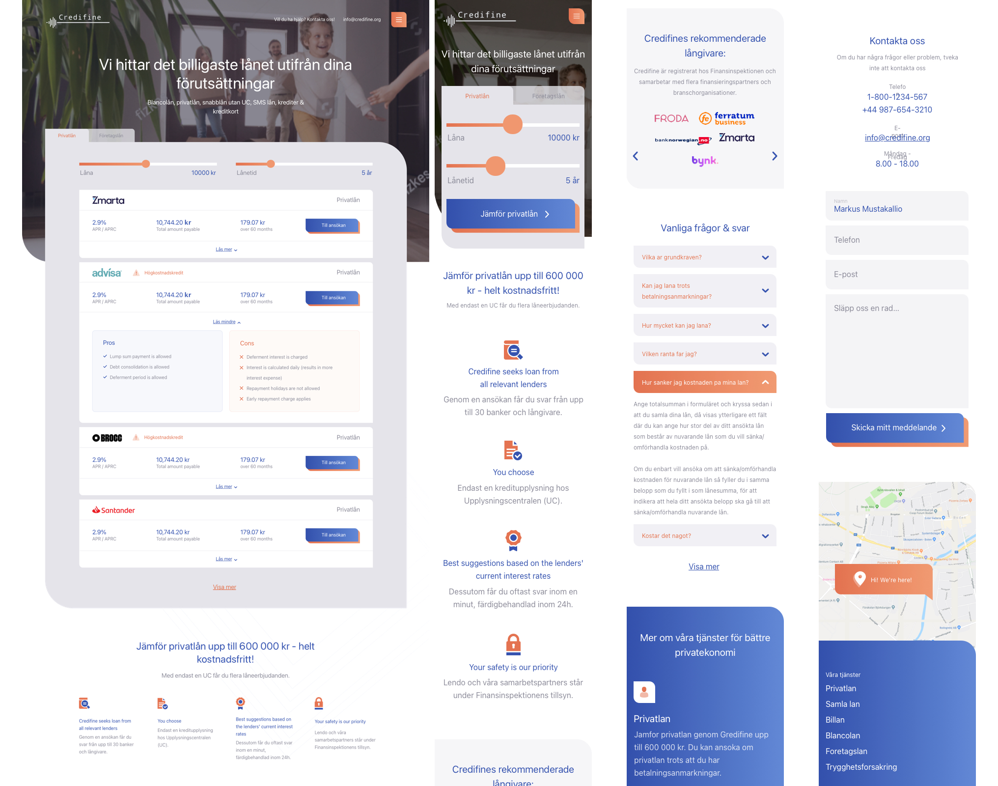
Credifine

Customer
Credifine, Sweden
Date
25 June 2020

Tech stack
Design: Adobe Illustrator, Figma
Tasks
A client has set a task to make an easy-to-use and unchallenging interface for a credit aggregator. To provide the client with the possibility to find quickly and easy, to compare and choose a credit product, which meets all demands.
Challenge
We have researched a Scandinavian online credit market and found out the most popular and required information about credits. 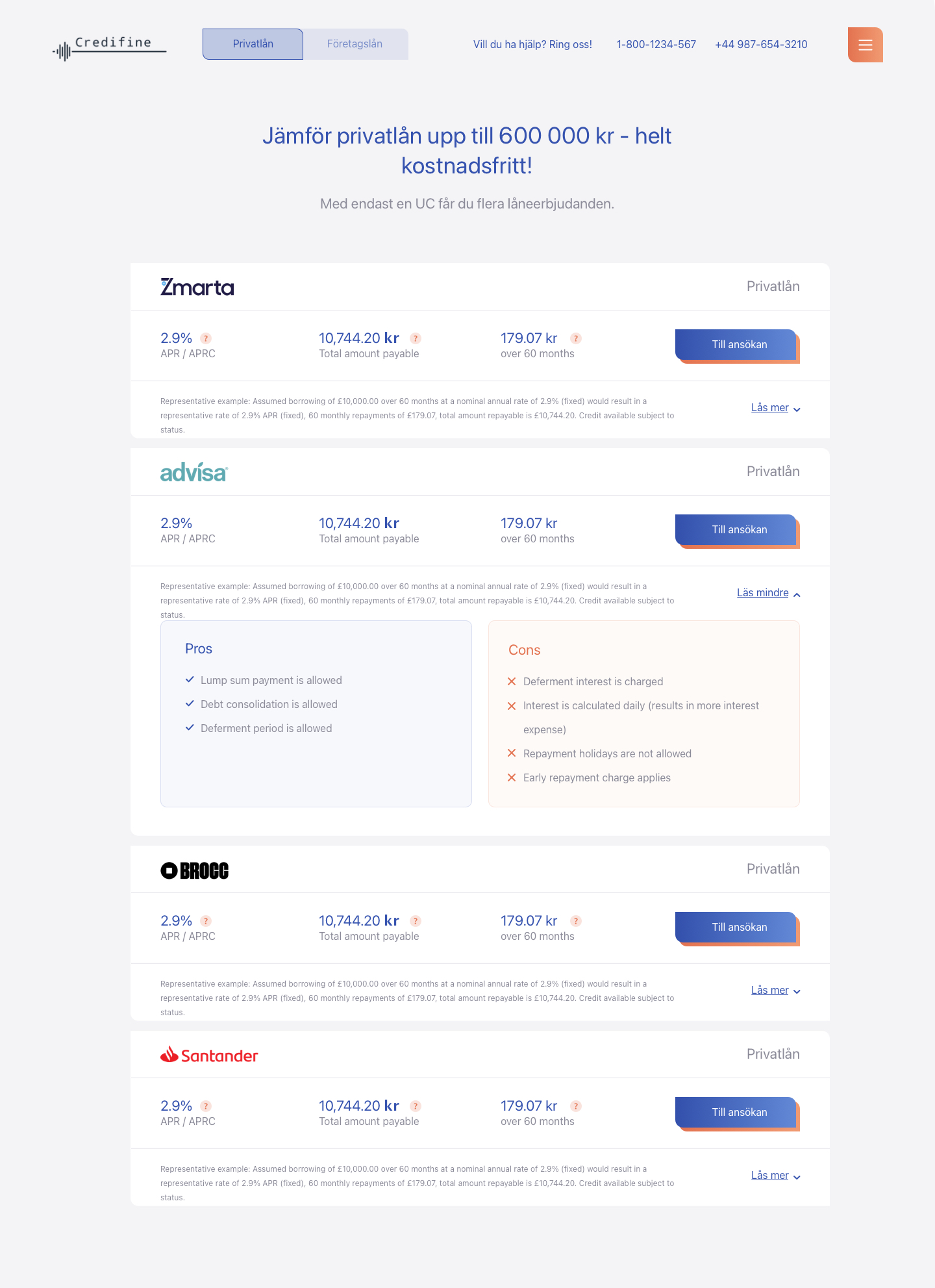
Solution
We decided to develop a website with a minimum of design to bring into focus the key information about the credit products to avoid client distractions. It turned out that, the Pros and Cons comparison charts are to clients’ taste. According to their minds, these charts are useful and easy to use. We made a filter to search for credits in such a manner as to provide the client with an opportunity to use it using both traditional computers or devices with touchscreens.
