SimplyFlights
Customer
SimplyFlights, UK
Date
20 March, 2021
Tech stack
Design: Adobe Illustrator, Sketch, Figma, Adobe After Effects, Pen tablet
Frontend: Vue.js, jQuery, HTML5
Tasks
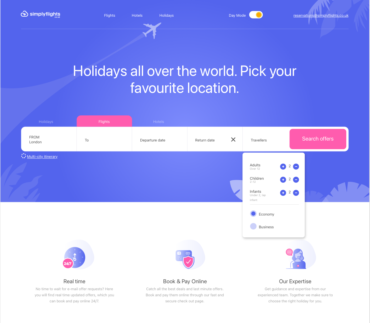
Our task was to create a corporate identity UI for the Travel Booking website.
Challenge
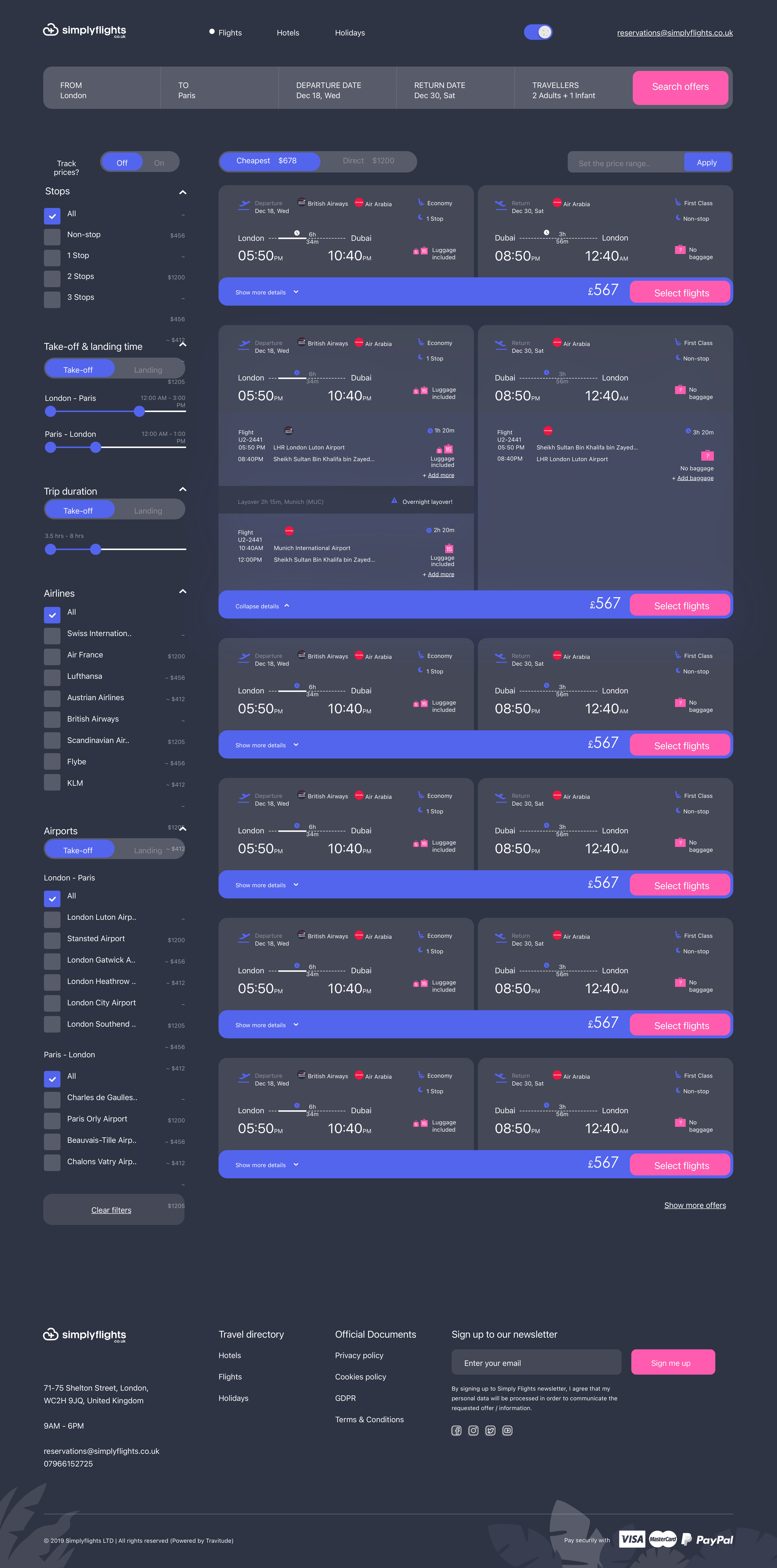
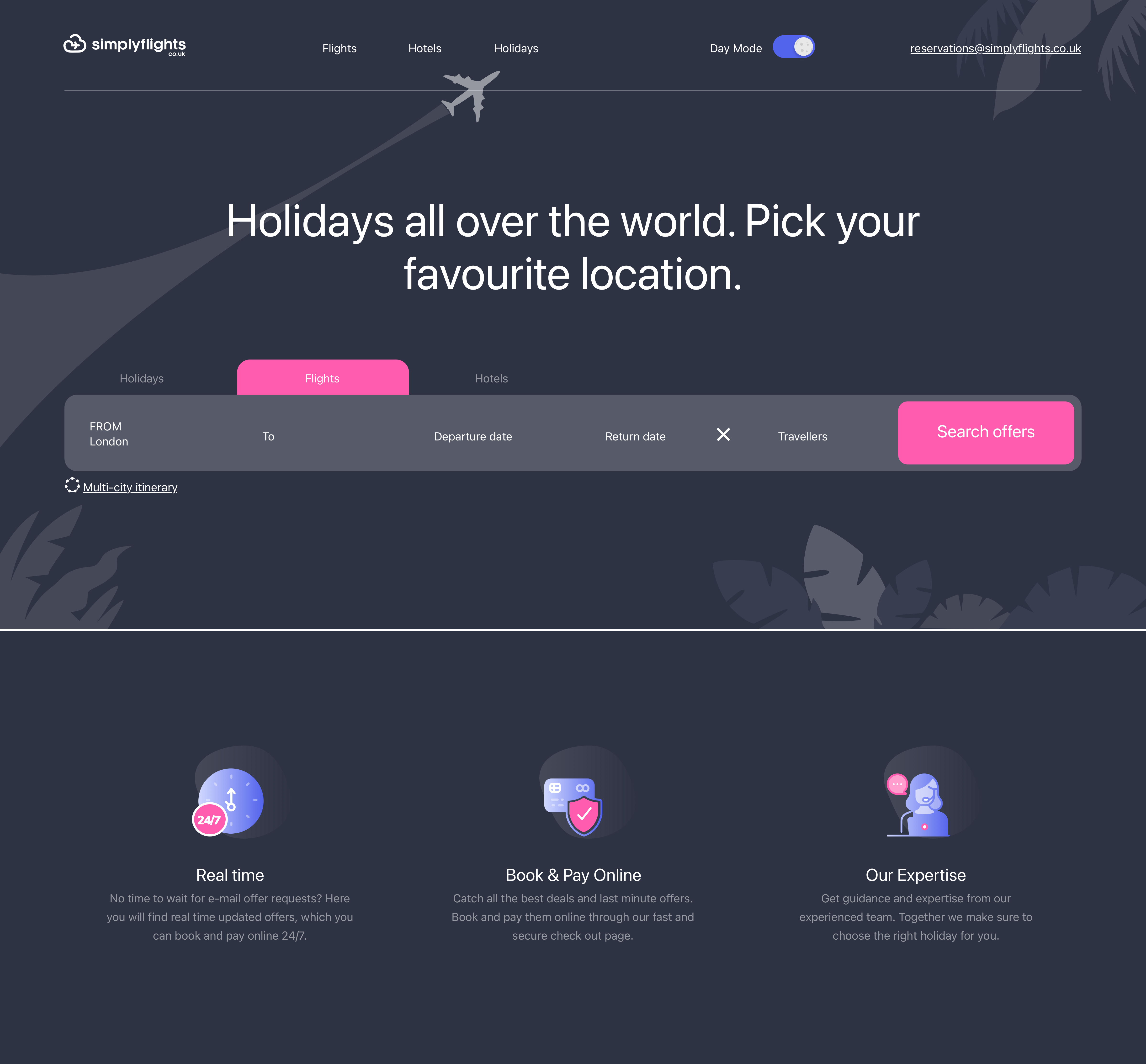
The client wished to have the website style featured to shift the light/dark mode from day to night depending on the customer’s time of day. In addition, the design of the website should be implemented in a simple, casual style.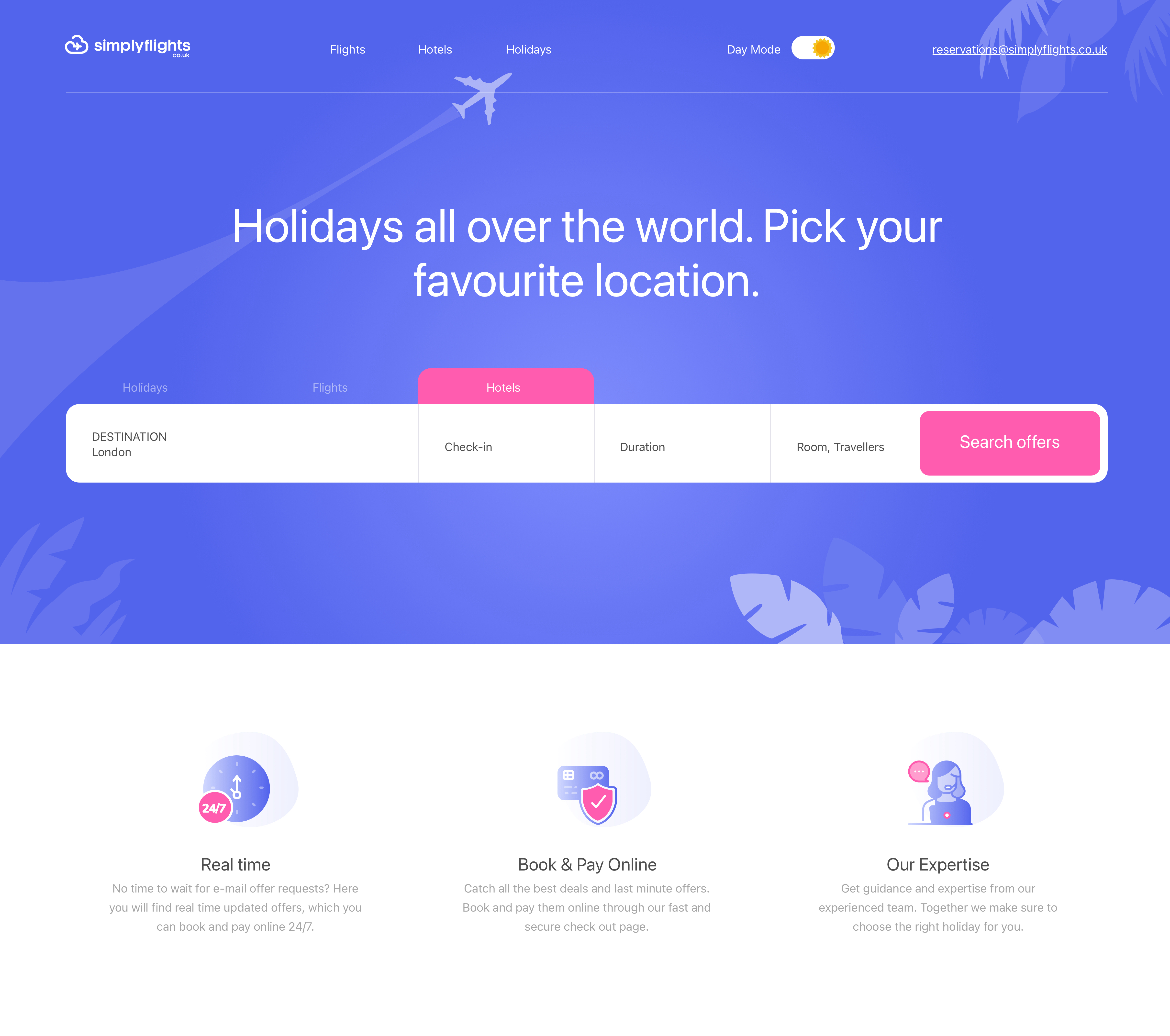
Solution
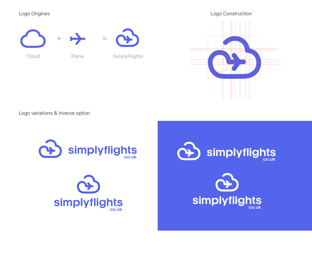
We have considered adding the image of a plane in the logo, due to the usage of the Flight word in the website name and the fact, that sale of airline tickets is the main purpose of this website. Moreover, the image of the cloud became the second part of the logo, as the client wanted a light and airy style. We have developed and implemented two systems of samples such as day and night depending on the website customer’s time of day. The sample switches automatically. Also, we have created unique icons. At first, our specialists drew them, and then added them to the illustrator.
